

  |
||
  |
||
| Our trans fats campaign is not about obesity, but as people visiting this website are generally interested in food, nutrition, and health, we thought that you'd like to see these maps from the Centers for Disease Control. They show that Americans have been getting more obese each year. For example, the first map for the year 1985 shows states in which less than 10 percent were obese (light blue) and 10 to 14 percent were obese (dark blue). The maps only show the percentage of people in each state who are "obese," not people who are "overweight." If you want to know whether you are considered "obese" or "overweight" using the Body Mass Index ("BMI") click here if you are an adult and here if you are a child or a teen. (Note: The BMI Index is very general and does not take into account factors other than height and weight.) One of the effects is an epidemic of children and adults who are getting type 2 diabetes as a result of their obesity. This is a national health disaster. Scroll down this page to view the annual maps one at a time or click here to see an animated version of the maps. If you want to know how we got into this mess, we recommend that you read "Fat Land" or "Fast Food Nation." Also we recommend "Food Politics" if you want to know about the political machinations that made this mess possible - and perhaps inevitable!
And finally - 2004 (Note the different color scheme)
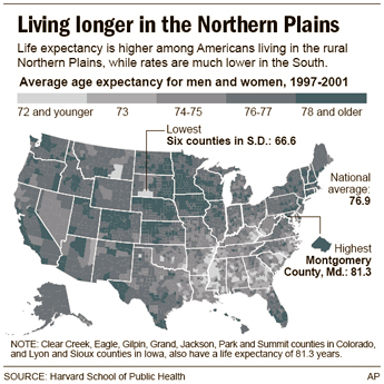
Now look at this life span map based on a report published by the Harvard School of Public Health in September 2006. See the connection? 
Click here to read the Harvard School of Public Health media release about the report.
© 2003-06 BanTransFats.com, Inc. |